Quick recap before you enroll
We encourage you to read through the following selected statistical concepts before enrolling in the course. You can think of these concepts as informal prerequisite for taking the course. We do not explain all the terms we use in this section, because you are already expected to know them on entering the course. If you are mostly familiar with what you read here, and perhaps only need to refresh on some details, chances are you are prepared to take the course. If it mostly looks unfamiliar, consider taking some introduction to statistics first. For our department’s students, Statistics I and Statistics II are prerequisites for this course (if you have passed them, you are good to go, but you may still want to read the rest of this section to refresh your memory).
Variable and its distribution
A variable is an attribute, which can take different values. E.g. height is a variable as different people can have different height. So is an opinion about something. Or one’s age or gender.
Types of variables
There are three basic types of variables:
- nominal (such as town of birth)
- ordinal (such as achieved degree of education - can be ordered from lowest to highest)
- metric (such as height or temperature in Celsius degrees)
Metric variables are also called cardinal and they fall into two subgroups: interval and ratio. For interval variables, the same interval in its value is the same quantity. For examples, the difference between 10 and 20 Celsius degrees is the same as between 20 and 30. For ratio variables, this is also true, but also we can refer to them as ratios: for example, when one person is 200 cm tall and the other is 100 cm tall, we can say the first person in twice as tall. This is not the case for temperature in Celsius degrees (which is interval, but not ratio): we cannot say that 20 degrees is twice as warm as 10 degrees. Interval variables have artificial 0, ratio variables have natural 0 (or in other words, for ratio variables, 0 means nothing, whereas for interval variables, 0 is arbitrary - different for Celsius and different for Fahrenheit, for example).
For the rest of this recap chapter, we will consider metric variables.
Variable distribution
For a variable with known values, we can construct its distribution. Frequency distribution uses actual counts (it provides information such as that there are five people with height between 150 and 155 cm in a given group of 50 people). Probability distribution gives probabilities of occurrence of different possible values (e.g. the probability of having height between 150 and 155 cm is 10% etc.).
Below, there are some commonly used plot types which help understand distribution of a variable visually.

Plot A is a histogram displaying frequency distribution. Histograms use bins to categorize continuous variables. As a result, they are closely related to column charts. 1
Plot B uses probability density function to display probability distribution. While we cannot directly read number of occurrences for each value of variable z, we can perceive the relative likelihood of each value of z. 2
Plot C is a boxplot. Unlike histogram and density plot, what boxplot display is not directly linked to the raw data. Instead, it is constructed from selected distribution statistics (the 1st, 2nd, and 3rd quartile). For this reason, people sometimes like to overlay boxplot with actual data points (we use so called jitter to avoid overlapping - the horizontal differences in the data is purely random, only the vertical differences carry information). Note that the bimodality is not easy to spot in the data points themselves.
Plot D is a combination of a violin plot (which is itself a density plot simply turned by 90 degrees and mirrored on both sides, compare to plot B) and a boxplot. The violin plot helps to spot distributional peculiarities, the boxplot is there for the summary statistics.
Plot E is a raincloud plot. According to this blog it was only presented in 2019 so it is a pretty new concept (unlike all the above). It combines density plot, so called slab intervals and raw data categorized into bins. The slab intervals shows IQR and 95% range of the data (so the middle part is just like in boxplot, but the ‘whiskers’ represent something else than in box plot).
Plot F is labeled as an alternative raincloud plot. People are not used to the slab intervals, so to avoid confusion, they have been replaced with a boxplot (this one is fine-tuned with indent around the median which represents roughly the 95% confidence interval around the median). In addition, the rain drops no longer represent individual data points as in plot E, but percentiles (instead of N dots, where N is the number of observations, there are 100 dots) - this is a useful simplification for large datasets. 3
So which one should we use? It depends on the goal of our visualization. A and B can be fine if we are just interested in the shape of distribution of one variable (but we should try different values of the binning/smoothing parameter to make sure we are not mislead). When we try to compare distribution for various groups, we often want something which also displays summary statistics. C is fine for small Ns, but the overlaying points get less helpful when the number of observations is large. D is a fairly universal solution and is quick and easy to do in R. E and F require somewhat more effort to prepare, but they are very appealing both conceptually and visually.
Variance and mean
Variability within a variable can either be expressed visually (above), or it can be expressed with a numeric value, typically the variance or its favorite derivative called the standard deviation.
Variance of the variable z is the expected value of the squared deviation from its mean, we use the following formula:
\[ var(z) = E[(z_i-\mu_z)^2] = \frac{\sum (z_i - \bar{z})^2}{n} \]
We typically work with the standard deviation (variance transformed by taking its square root) rather than the variance because standard deviation is on the original scale of the variable distribution. The formula is as follows:
\[ \sigma_z = \sqrt{var{(z)}} \]
We also use point estimates to simplify a variable. A typical example is the arithmetic mean. We refer to the arithmetic mean of variable z as E(z) generally, or μz to refer specifically to population mean or \(\overline{x}\) to refer to sample mean.
Sampling distribution
Imagine you collect a survey sample from a population. It is only one of many and many theoretical samples you could have collected (e.g, there are many ways you can sample 1000 people from the Czech population). It follows that when you use the sample to calculate some values (mean of a variable, variance of a variable, … regression coefficient for a specified model), these are not the only possible values. In fact, each of these values is just one data point from a theoretical distribution of all the different estimates you could obtain from all the possible samples. This theoretical distribution is called sampling distribution.
“The sampling distribution is the set of possible datasets that could have been observed if the data collection process had been re-done, …” (Gelman et al., 2020, p. 50)
Obviously, we usually only have one sample, hence one data point from the sampling distribution for mean, variance or a specific regression coefficient. In other words, we typically observe no variation in our estimates. But we have variation in the data and that is what we use to estimate (or conceptualize) the expected variation in the estimates. (For regression coefficients, which will be much of our concern in this course, this is where assumptions are important, and we will talk about it in the lectures.)
The picture below displays sampling distribution of an estimate, in this case a regression coefficient. We use the Greek letter beta for regression coefficients and the hat above the beta marks that it is an estimate of the regression coefficient from the data - of course, the real population beta could be different. How much different? We never know for sure, but we try to conceptualize it from the sampling distribution.
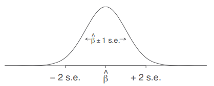
Sampling distribution of a regression coefficient. Source: (Gelman et al., 2020, p. 51)
The beautiful thing about sampling distribution is that it converges to normal distribution, no matter the distribution of the original variable. This is true for sampling distribution of a mean as well as for sampling distribution of a regression coefficient. Again, even if the original variable is non-normal, such as income in population, when you take many samples from the population and calculate the mean for each of them, the distribution of the means will be roughly normal. This statistical law is called Central limit theorem.
In the picture of sampling distribution above, the s.e stands for standard error which is simply a name for the standard deviation of a sampling distribution. It is estimated from the raw data as follows:
\[ \frac{\sigma}{\sqrt n} \]
Confidence intervals are an extension of standard errors taking advantage of the known properties of normal distribution: the 95 % confidence intervals are constructed by subtracting/adding ca 2 standard errors to the point estimate, see picture below (beta-hat is the estimate of the regression coefficient beta from the data).
Statistical significance and hypothesis testing
Conventional wisdom says: statistical significance is p-value less than 0.05, relative to some null hypothesis (hypothesis of no difference). Fair enough, but remember that the 0.05 value is arbitrary.
Yet regardless of the cut-point and whether it should be 0.05 or less as people have suggests, what is the p-value? It is used so much that we really should have solid understanding.
“[p-value is] the probability under a specified statistical model that a statistical summary of the data (e.g., the sample mean difference between two compared groups) would be equal to or more extreme than its observed value” (Wasserstein & Lazar, 2016)
A statistical summary of the data can be a mean. Or a regression coefficient. Or a difference between two group means. As an example for the latter, assume we are interested in the difference of mean income between men and women. We collect the data for 50 randomly selected men and 50 randomly selected women and use a t-test to compare them. The table below shows the result.
| parameter | value |
|---|---|
| est. of diff. | 1382.9 |
| est. men | 31174.08 |
| est. women | 29791.17 |
| t statistic | 1.52 |
| p value | 0.13 |
| df | 97.95 |
| conf. low | -418.69 |
| conf. high | 3184.49 |
| method | Welch Two Sample t-test |
| alternative | two.sided |
We see the difference between the two groups is 1382 (say Czech Korunas per month) in favor of men. What can we conclude from this about the underlying population of women and men? This is where p-value comes in handy. Going back to the definition above, we can read that there is a 13% (p value of 0.13) probability that we could observe a difference of 1382 CZK or bigger (more extreme) under a specified statistical model.
What is the specified statistical model? Well, in our case, it is a t-test for two independent samples assuming as null hypothesis that the difference in mean income between men and women is 0. T-test is a so called parametric test which assumes normality (normal distribution) of the tested difference of means between men and women. As we only observe one value of the difference of means (the value of 1382 CZK), we usually test this assumption by checking that the raw income variable is roughly normally distributed. Since the test in our example is two-sided, the probability of 13% concerns both values 1382 and more in favor of men and also in 1382 and more in favor of women. As the arbitrary cut-point is 5%, we would normally conclude that this p-value is not enough to reject the null hypothesis that there is no difference between men and women.
There are many other tests than a t-test with a variety of assumptions and drawing on a variety of distributions, but the meaing of p-value is always analogous to the example above. The intuition behind statistical significance is as follows: an estimate is said to be NOT statistically significant if the observed value could reasonably be explained by chance.
This approach to statistics is called null-hypothesis testing (NHT) and while dominant, it is subject to heavy and increasing criticism for both its properties and a variety of ways in which researcher misuse p-values.
Critique of NHT properties
- NH (no difference) is unrealistic in social sciences where everything is linked to everything (it is only a matter of sample size whether something is statistically significant, with enough data, almost everything gets statistically significant)
- NH is theoretically uninteresting (effect size and variations in effect sizes in different groups is what really matters, not the unambitious claim that some difference exists)
- NH is a very low threshold for any analysis, because non-rejection tells us that there is not even enough information in the data to move beyond the banal null hypothesis of no difference.
- The whole logic is weird: we look at the probability of observing given data given a (banal) null hypothesis, whereas what we really should want is to assess the probability of (some realistic) hypothesis given observed data.
- Even statistically non-significant data can carry important information (e.g., for meta-analysis or updating our priors in Bayesian approach).
Despite this critique, many believe that NHT can still be useful to set some shared threshold in a discipline, especially when we tend to use similar sample sizes. But it has to be used correctly. Often, it is not, see below.
Critique of malpractice in using p-value
- p-value is often used as a license for making a claim of a scientific finding (or implied truth) while neglecting many other important considerations (“design of a study, the quality of the measurements, the external evidence for the phenomenon under study, and the validity of assumptions that underlie the data analysis.” (Wasserstein & Lazar, 2016)
- p-value is often used incorrectly (significance chasing a.k.a. p-hacking): (1) multiple statistical tests are conducted and only the significant one is reported - this is wrong, NHT is designed for a scenario when we first formulate a hypothesis, then collect the data and test it, (2) choice of data to be presented is based on statistical-significance of results, also see publication bias.
- p-value is often interpreted incorrectly, such as when non-significant p-value is considered evidence for no difference. Of course, we would like the test to work like that - if it does not provide evidence for difference, it should at least provide evidence for no difference. Unfortunately, p-value does not work that way. Non-significant p-value absolutely cannot be interpreted as evidence or support for no difference. This is why stats teachers across the globe emphasize: “We never accept the the null-hypothesis. We either reject it or we fail to reject it.”
- There is (usually almost) no difference between 5.1% and 4.9% significance level.
Examining relationship between variables
In social sciences, we often want to know how two variables are associated, i.e., how they vary together (co-vary).
A basic measure of association between two metric variables is called covariance. Many measures of association draw on it one way or another. It is very closely related to variance. Inspect the the formulas below to see for yourself:
\[ var(x) = E[(x_i - \mu_x)^2] = E[(x_i - \mu_x)*(x_i - \mu_x)] = \\ \frac{\sum[(x_i - \mu_x)*(x_z-\mu_x)]}{n} \]
\[ cov(x) =E[(x_i - \mu_x)*(y_i - \mu_y)] = \\ \frac{\sum[(x_i - \mu_x)*(y_i-\mu_y)]}{n} \]
The value of covariance is rarely useful as the end product. Just like we prefer standard deviation as a scaled form of variance, we prefer correlation as scaled form of covariance. While standard deviation is scaled to the scale of the original variable, correlation is scaled to take a value between -1 and 1. In this sense, correlation is standardized covariance and measures strength of association.
If you square Pearson correlation coefficient between two variables, you get the proportion of variance in one variable which can be predicted by knowledge of the value for the other variable. This relationship is symmetrical (if x explains 20% of variation in y, then y explains 20% of variation in x). When you think about it, this means that we should not understand correlation coefficient as linear in the sense that increase of correlation coefficient by 0.1 always represent the same increase in the strength of association. If the coefficient is 0.2, we can explain only 0.04, i.e., 4% of variance in x by knowing the value of y. If the coefficient is 0.3, it is 9%. If the coefficient is 0.4, it is 16%. So moving from 0.2 to 0.3 means 5 percentage point decrease of unexplained variance, whereas moving from 0.3 to 0.4 means 7 percentage point decrease of unexplained variance. And so on.
Visual representation of different values of Pearson correlation coefficient puts things into perspective:
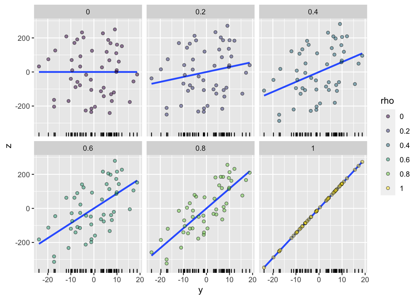
Code by whuber from: https://stats.stackexchange.com/questions/15011/generate-a-random-variable-with-a-defined-correlation-to-an-existing-variables
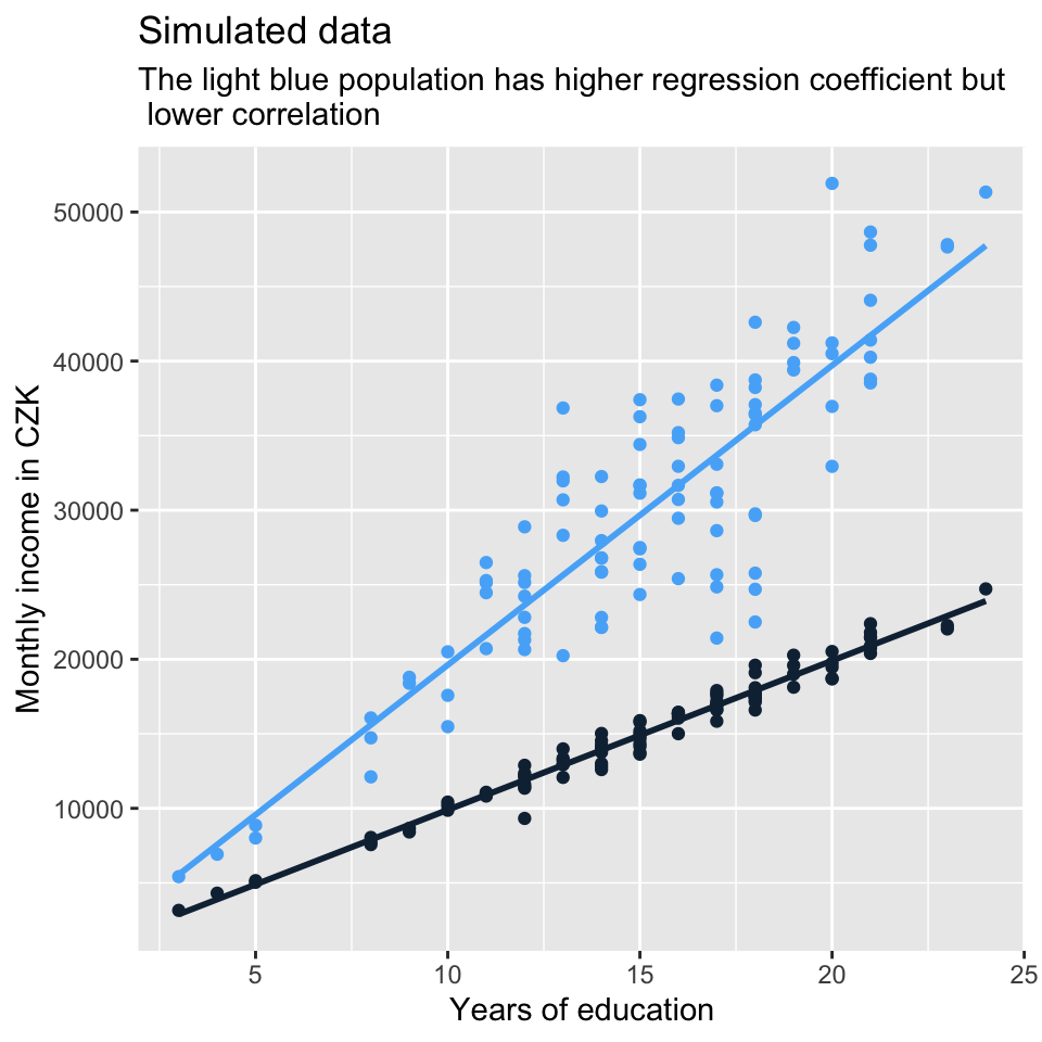
Correlation coefficients and regression coefficients (which will be covered in the course) are conceptually a different thing. While correlation coefficient shows the strength of association, regression coefficient shows how, on average, the value of y changes when the value of x changes by one unit (we will talk about this more). The fact that the regression lines in the set of plots above get steeper and steeper as the correlation gets stronger results from the data generation process. But it is no necessity. There can be steeper regression lines between less correlated variables and vice versa. See another set of simulated data below which demonstrates it.
The four plots below show that the message sent out by visualization of a relationship between two variables can differ based on the tools we use. The plots below all visualize association between the same two continuous variables. Plotting just the regression line or just the points can send out a fairly different message about the association. Combination of the two seems more appropriate in this particular situation. Also remember that using straight line is not the only way to model association between two variables. In this case, we let the line in model D follow the data more closely (the line bends a little). However, the departure from straight line is so minor that straight line actually does seem a good approximation in this example.

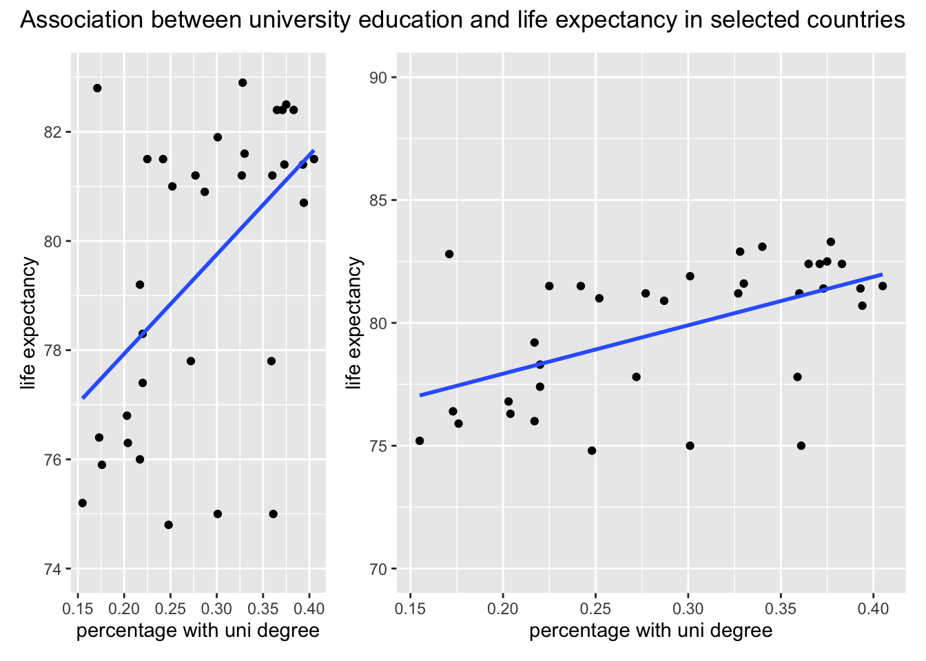
Similarly, the message sent out by visualization can be strongly influenced by plotting decisions (or defaults) which have no relation to the data. See below two plots of the same relationship, but plotted with different width and y scale limits. Greater width makes the slope of the line seem less steep. Looser y scale limits (70 to 90 as opposed to 74 to 82 further strengthen this effect).
References
While not our concern here, the impression from a histogram can be strongly influenced by the number of bins.↩︎
Beware, density plot is sometimes recommended as a solution to the arbitrariness of number of bins in histogram, but it actually suffers from a similar problem - the final appearance depends on a smoothing parameter, so the same data can also produce multiple differently looking density plots.↩︎
Notice that the density shape in plots B and D is different than in E and F even though it is the same data. This is because in E and F, we set a different smoothing parameter. So indeed, there is some arbitrariness in density plots,just like in histograms.↩︎